The Intricacy of Currency Design
At five by two point six inches, with classy UV lamination, the Mexican cincuenta pesos is twenty-first century Aztec sophistication in all its glory.
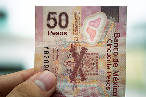
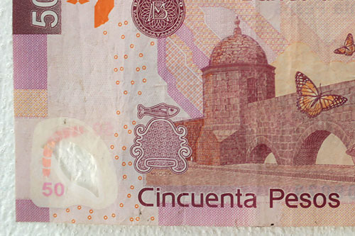
The bill is compact and representative of modern Mexico. It utilizes a cool-neutral color pallet and modern sans serif typography. Historical figures and landmarks, political crests, and distinct fauna give it Mexican genetics. But beneath identity and that sexy smooth, rubbery coating lies an art more intriguing — an intricacy of security mechanisms.
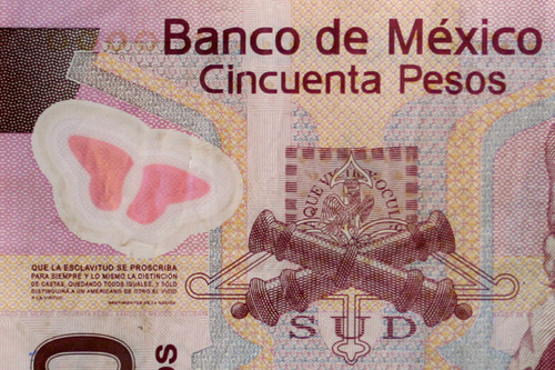
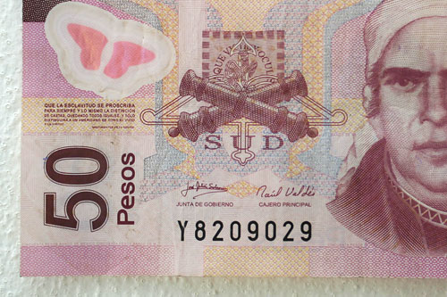
It's perhaps the most distinct aspect of Mexican capital. A closer look shows over 20 security features from finely printed patterns and text to semi-transparency and embeded illustrations.
 Intricate patterns.
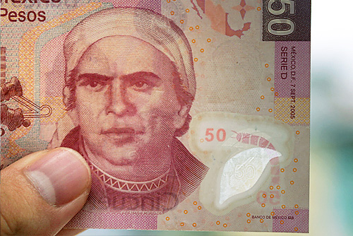
One might wonder if the butterfly is an accessibility feature for the visually impaired, like Braille.
The 50 peso note seen here is a new plastic paper version and was introduced in 2006. Visit this site for more about the mexican peso. Until then, keep on counting those security features.
 Typography.
 Transparency.
![]()


3 comments:
I can't wait to go to Chets and get one of those.... I might not want to spend it.
Hey interesting stuff i am so cought up in my little world i had no idea or even care about a cincuent peso. However i am interested to see one now that you point it out. cool, hey nice pic, dude is it just me or are you gettiing chubby. Papi... lol
see you sometime soon...
It's so true! The plasticy feel is awesome the 50s and the 20s feel like that. It's nice. The clear plastic fooled me at first though...thought it had a hole and I was gonna give it back (They really try to take care of their money hence vendors don't accept mutalated bills.) Hmmm makes me wonder how expensive is it to print their money? You know, with all those security features and color.
Post a Comment